PLEASE ROTATE YOUR DEVICE
PLEASE ROTATE YOUR DEVICE

Confidential information for this case study has been omitted and obfuscated to comply with non-disclosure agreements. All presented information and opinions are my own and may not reflect the views of HTC.
How can we make setting up a VIVE virtual reality system simple enough for a consumer audience?
WHAT IS IT?
THE PROBLEM
Prior to the initial consumer launch of the VIVE virtual reality system, I observed that even our most technically adept team members struggled with getting early prototypes of the device set up correctly.
As the designer responsible for creating the out-of-box experience flow for HTC’s phone products, I had experience with designing robust and straightforward onboarding experiences and I realized that we would need to take a similar approach for VIVE. In this case, we would have to define a user experience for a new product category that most customers would have no prior experience with nor foundational knowledge to fall back on. Like smartphone setup, the VIVE OOBE would require clear and careful messaging around the order of steps for setting up both hardware and software components, but VIVE consisted of 6 hardware components and 3 different software installations – an order of magnitude more complex than a smartphone setup.
Further complexity was the need to coordinate with our partner, Valve. At the same time that we were developing VIVE, they were defining and developing the operating system (SteamVR) that VIVE would run on. We had to be nimble in our iteration, testing, and reporting cycles to be sure that hardware and software engineering, as well as the many other teams involved in the product, were getting the appropriate feedback and recommendations for overall product alignment.
ROLES
Product Owner – Myself
Lead UX – Myself
Lead User Research – US/Taipei Team
Visual Design – US/Taipei Team
Development – Taipei Team/Valve
ID – US based
Engineering – Taiwan based
Packaging – Taiwan based
PROJECT TYPE
Packaging Design
Packaging Inserts
Windows Desktop Apps
PROJECT TIMELINE
About 10 months from kickoff to shipping.
INFORMING THE DESIGN
THE KNOWLEDGE
Before designing the foundational structure, I needed to understand the issues that existing users were facing.
Fortunately, we had already released VIVE Pre, a developer kit, to a limited audience of users and developers. This kit included only minimal packaging and a single sheet of instructions on how to set up the device. This gave us the perfect opportunity to build from the ground up and see where people were having the most trouble. We scoured user forums and conducted interviews with our developer community to learn about these challenges.
VIVE Pre box:

We used this knowledge as a base to jump-start our first phase of user testing in the Spring of 2015.
PHASE 1 USER TESTING
Working with a User Researcher we tested 21 participants over a two week period. After testing about 3-5 participants, we would analyze the data and made iterations to the testing materials, rapidly making improvements to the design.
As a baseline measurement, we started with the Valve-created paper setup guide for developers and the VIVE Pre box. The average setup time for this iteration was 90 minutes—far too long.
Valve setup guide:

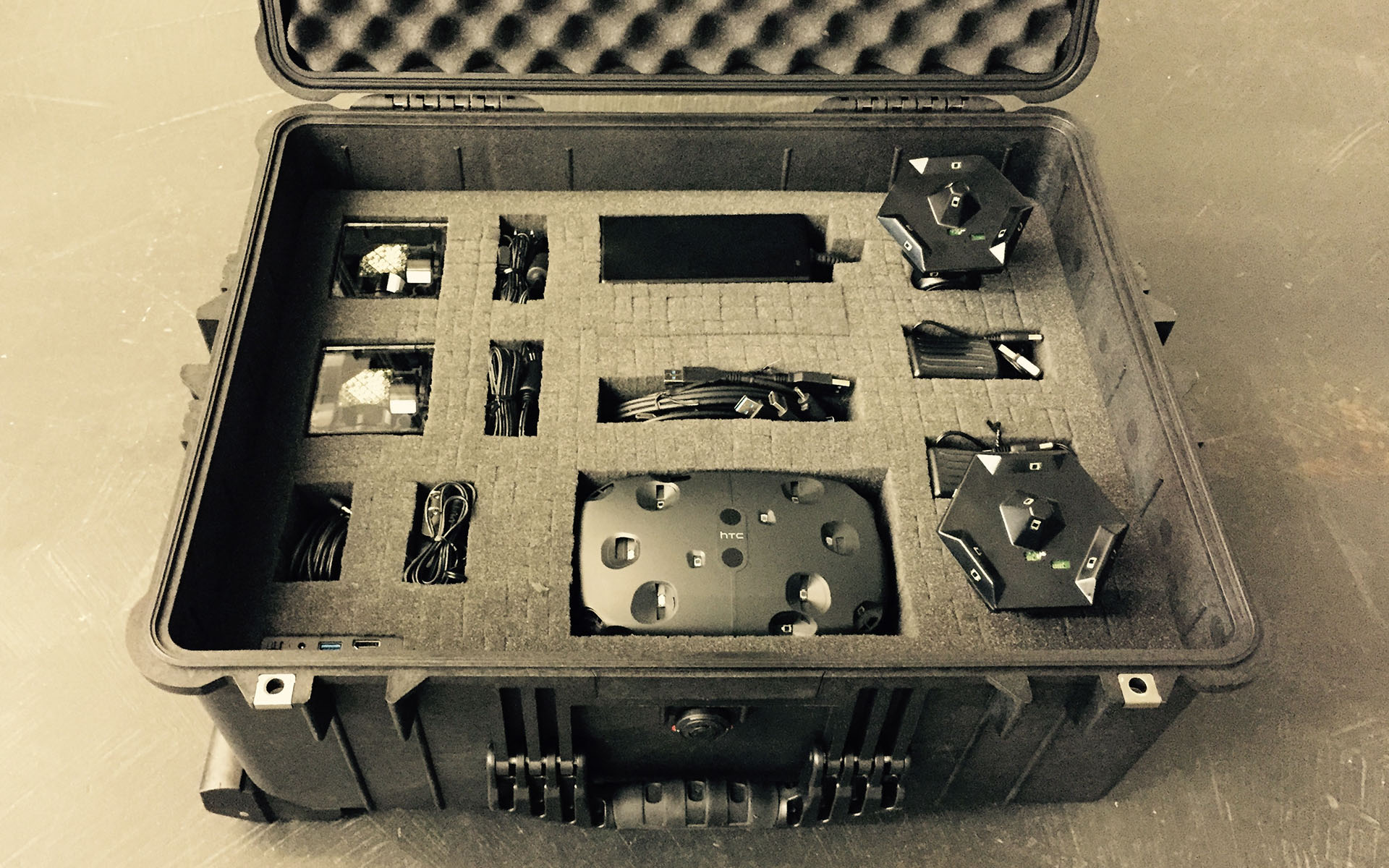
By the end, we were testing with a more refined paper guide and custom Pelican case that took participants an average of 50 minutes to set up—an improvement we were happy with in this context but were eager to further improve for the retail launch.
Our revised testing materials:

FINDINGS
Here are some of the issues we found during testing:
1. Users Don’t Read
We started with paragraphs of copy and we ended on making more bulleted and concise instructions with more visual aids because we found that users often were too excited to get the system up and running.

2. Too Many Steps
The Valve guide had 32 steps which were mentally overwhelming for the participants. We ultimately went with a hub and spoke model, where we divided the setup into sections: play space, base stations, headset, controllers. This gave the perception of a quicker setup and helped with the mental load.

3. Packaging needed structure
The original Valve guide had the user unpack everything which caused a lot of confusion as to which cable and devices belong to which step. Ultimately, it was more ideal to package the cables with their respective piece of equipment as well as have the users unpack the necessary components only when they needed them.

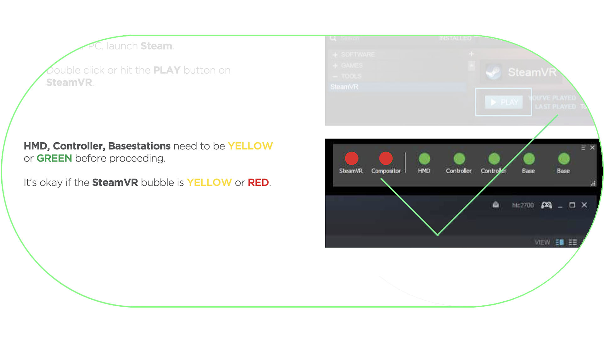
4. Confirmation of success was needed
Because of the importance of completing each step successfully, we had to have a way to verify, after each section, that they completed the steps successfully. We also had to provide troubleshooting information if they failed.
SYNTHESIS
KEY DRIVERS
From phase 1 testing, I was able to synthesize some key drivers for the first iteration
1
SECTIONALIZE
Divide the process in more manageable buckets of instruction.
2
STEP-BY-STEP
Create a linear process that is controlled to prevent users from jumping around.
3
VERIFY
Make sure the steps were successfully done before progressing the user to the next step.
4
VISUALIZE
Create a linear process that is controlled to prevent users from jumping around.
Looking at these drivers, and the results of the user testing, it was made obvious to us that we needed to create a digital setup app that was able to more visually instruct the users and verify their progress.
I created this user flow as a result of the above learnings.

And through about a month of iteration and peer review, the user flow led to fleshed out wireframes. Here are a couple of excerpts from them:


EXECUTION
PACKAGING
I worked with the packaging team to guide the retail packaging with the learnings above.

VISUAL DESIGN
While creating the wires, I worked in parallel with a visual designer to define how the digital setup would look.

TECHNICAL FEASIBILITY
I also worked closely with the software engineering team to understand what was feasible and what were the implementation challenges and work through them appropriately over the next two months.
DESIGN VALIDATION

PHASE 2 USER TESTING
At the start of Fall 2015, after a few design iterations, we were ready to put our digital setup app to the test with a new set of users to validate the design. Over the course of a week, my User Researcher and I tested 9 participants in their homes. This would give us even further insight into what real customers would experience outside of a lab setting. Our new testing materials used for Phase 2 we tested were the new digital setup app, a prototype of the retail box, and a printed setup booklet that mirrored the digital setup app.


FINDINGS
Here are some of the findings from this phase:
1. Confusion with digital vs printed guides
Our User Education team was adamant about providing a paper copy of the steps in the box. I had a really bad feeling that this would cause confusion so I was eager to put this to the test. As a result of testing, we found that users would go between the setup guide and digital guide losing track of their progress. Ultimately, 8 out of 9 participants dropped the paper guide altogether so we decided to forego the printed guide completely.

2. Digital guide controlled progress
Because of the linear nature of the guide, users were not able to accidentally skip steps. This proved to provide an 80% increase in success rates for setup.

3. Packaging still needed improvements
Leadership was more concerned with the presentation of the product. As a result, important accessories and cables were hidden with no visual affordances. I prototyped some packaging loops that greatly helped users understand that there was more underneath.

4. Verification not always done properly
We were asking the user to verify their progress in order to progress in the steps. This often was overlooked as users assumed, they had done things the correct way. This was reported back to the engineering team and I worked with them to develop different ways to programmatically verify that users would complete the necessary steps.

FINAL VALIDATION
PHASE 3 USER TESTING
In the Winter of 2015, with all the updates made in the previous phase of testing, we did a final test of an additional 11 participants before shipping the product to the public.
FINDINGS
Here are some findings for this final phase:
1. Setup time wasn’t an issue
We found that 100% of participants did not have any issues with the length of the setup time. They were more concerned with setting up the system correctly. While this was true, leadership still wanted us to work towards a shorter setup duration. We were able to go from an average of 90 minutes at the start of the project to an average of 40 minutes in this phase of testing.

2. Not knowing where to start
Since we were not including the printed guide, we had to direct users to a URL to download the digital setup. This was a simple “Get Started Here” message that they would see when they first open the box.

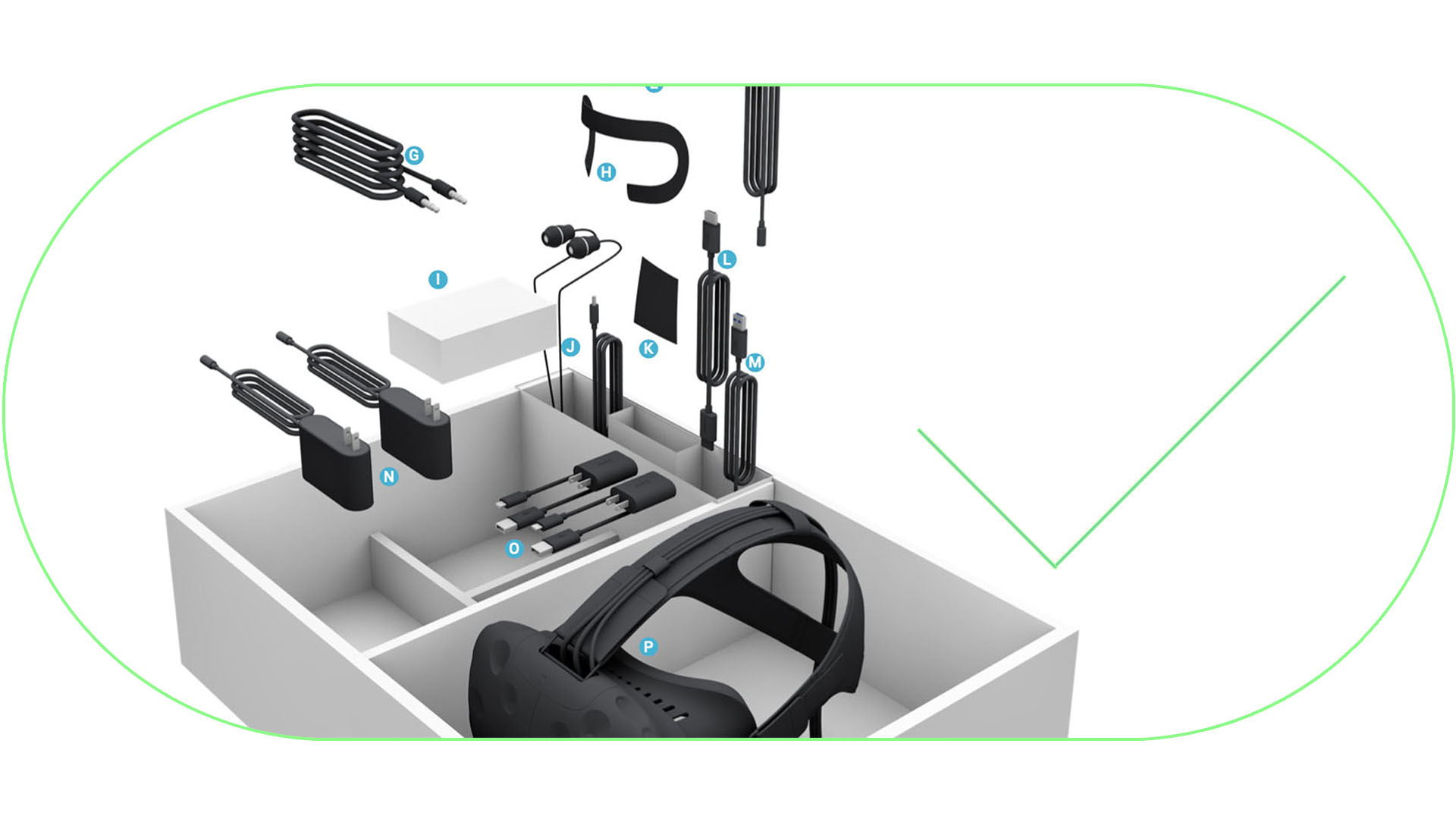
3. Users had trouble finding parts
Users would sometimes miss some parts of the system and had trouble finding them inbox. I worked with my visual designer for a rendering of the box in an exploded view and I worked on the final formatting of the key.
CHALLENGES
First Step Guidance
This “Get Started Here” message was often overlooked because it was off to the side of the box. We decided to make it impossible to ignore by making the form factor and message more prominent. The QSG would cover the whole box and would be the first thing users would see before they could view the hardware. I designed the Quick Start Guide (QSG) to address this issue.

In-box map
From the testing, we knew that for the packaging, we had to provide some sort of illustration and key to where all the parts were in case the user had trouble finding a particular piece of the system during setup. Since we had a huge sheet for the QSG, this enabled us to also print the in-box map on it as well.

Room Setup
Another major challenge we ran into was the Room Setup or “Chaperone Setup” handoff. The digital setup application was created by HTC, while the Chaperone Setup application was created by Valve. There wasn’t an elegant way for us to pass off the user over to Valve’s software, have them complete the setup, and recapture their attention for setup finalization. We ultimately had to relinquish user focus and hope that they would eventually return to our app to complete any final steps so we had to be sure that the most important steps were completed before the handoff.
REFLECTION

FINAL THOUGHTS
This was a really fun project for me. I love taking the time to fully understand the technical ins-and-outs of systems and disseminating the complexities, translating them to a more holistic concept. While consistency was certainly our goal in VIVE 1.0 OOBE, I would’ve preferred that we had achieved a more consistent experience through software install, hardware setup, defining the play space and chaperone, and the welcome tutorial. Unfortunately, there isn’t a singular voice from opening the box, through setup, and to a user’s first experience inside VR.
I think the biggest success for this project was demonstrating how important it was to create a consumer-friendly experience since this product is not only a gaming platform for technically-savvy users, but also a powerful tool for all industries whether it be medical and wellness, storytelling, training, and simulation, or simply the casual VR enthusiast.