PLEASE ROTATE YOUR DEVICE
PLEASE ROTATE YOUR DEVICE

Confidential information for this case study has been omitted and obfuscated to comply with non-disclosure agreements. All presented information and opinions are my own and may not reflect the views of HTC.
How do we enable an unassisted first-time VR experience?
WHAT IS IT?
The first thing we learned about introducing people to VIVE is that “seeing is believing.” While it is almost impossible to describe the experience of being in VR to someone, all it takes is a few moments in the headset to generate a sense of wonder.
For the first several years VIVE was on the market, the team invested heavily in person-to-person demonstrations at trade shows and events, walking people through donning the headset and controllers and chaperoning them in the play space while the demo content ran.
To scale our reach to a broader audience we knew we needed to do something else: create an experience that was approachable and intuitive to a broad range of experience levels. By enabling people to successfully experience virtual reality on their own, it would both remove some of the barriers to entry and reinforce the value proposition of the content itself, and aid in sales conversions.
The VIVE Demo Kiosk accomplished just that. The team conceived, tested and built the demo kiosk over 3 months deploying to over 100 locations.
ROLES
PM – Rotating Cross-Team
UX Design – Myself
Visual Design – Myself
Development – External Vendor
PROJECT TYPE
Unity Project
SteamVR Interface
Pseudo-Windows 10 Kiosk Mode
CHALLENGES
VR products are an entirely new category for people. In addition, we knew from our experience designing the retail OOBE that the order of operations, from donning and adjusting headset and controllers, to starting the VR experience was complex and sometimes daunting.
To expect the customer to accomplish all of this in a public setting, we knew we needed to establish trust and design a safety net so that users would feel comfortable trying the kiosk.
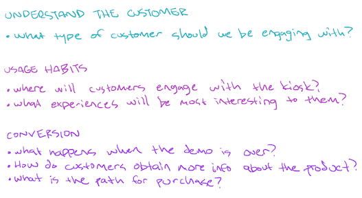
INFORMING THE DESIGN
DATA COLLECTION
To better understand customers’ behavioral reactions to this new product, we used these techniques:

BECOMING THE USER
To understand what’s it like to be the user, I had several people give me the demo to better understand what it was like to get a demo from someone very knowledgeable all the way to someone with a very general understanding of the technology.

COLLECT EXISTING DATA
Using existing demo scripts, learnings from the Out Of Box Experience project, and FAQ’s from the support team, I was able to create a base foundation to build on.

TAP INTO TRIBAL KNOWLEDGE
Throughout the company, there was a wealth of existing knowledge and personal experiences. Interviewing engineers, developers, designers, and the business and sales teams, patterns of challenges emerged.

FIRST HAND EXPERIENCE
I gave VIVE demos to over 20 people of different levels of experiences to identify challenges in the current methodologies of how demos were given.
THE BUSINESS
I wanted to be sure that not only were we giving the users a great experience but also that we were meeting business objectives. To that end, I worked closely with the product marketing team to ensure that key customer insights and business requirements were captured and incorporated into our solution.
SYNTHESIS

KEY DRIVERS
Armed with the above knowledge and business requirements, information was prioritized and key project drivers were established.
INTUITIVE
Enable a simple interface with clear guidance to keep the overall demo time low and throughput high.
FLEXIBLE
Create a dynamic experience that caters to all types of customers.
EDUCATIONAL
Provide clear and concise information that incites trust and enables a safe and immersive experience.
FOLLOW-THROUGH
Enable a customer pathway for additional product information as well as product purchase.
With that, I created a high-level journey map.

CHALLENGES
Then a critical decision needed to be made.
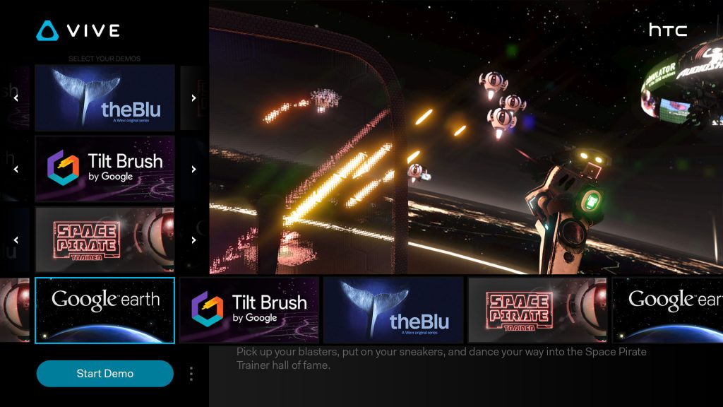
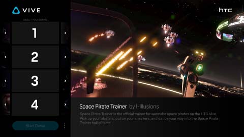
There were two schools of thought in regards to when to put the user into VR: before they choose their experiences or after. This decision would determine the foundation of the flow and how the experience picker would be designed.
PICK EXPERIENCES BEFORE PUTTING USER IN VR
Pros:
Guidance on disinfecting the headset and donning it can be given.
It’s easier to start the demo in a familiar UI especially for those that have not been inside VR.
Attendants can assist without getting into VR themselves.
Cons:
It adds complexity by
requiring different interaction methods.
IMMEDIATELY PUT THE USER INTO VR
Pros:
Streamlining all interaction within VR lowers complexity
The user gets into VR immediately.
Cons:
There’s a risk that first-time users would be unsuccessful at choosing their experiences and starting the demo.
The attendant starting the demo for the user isn’t as easy.
There may be a need to provide guidance on how to don the headset.
Ultimately we went with getting the user in after the experiences were chosen.
USER FLOW
Armed with knowledge, I created a foundational user flow to build upon.

WIREFRAMES
From there, I took each bucket and fleshed out screens and stitched the whole experience together into a cohesive user journey.

DESIGN VERIFICATION
PROTOTYPING
With the wires complete, we worked with the development team to build rough prototypes of the experience to do some quick internal testing with key stakeholders.

CHALLENGES
Regarding the 2D interface that allows users to choose the experience they want to try–the major finding was that we needed to consider the different types of input that were available to the user. I quickly created prototypes to better illustrate how UI interaction using the various input models would look and rapidly iterate on the interaction models.
The following are findings specifically for how users expand the experience carousel and select their desired experience.


MOUSE
The default method of interaction. This method required free navigation of the cursor to any point on the screen that afforded hover and click behavioral differences.
The experience carousel opens when selection tiles were hovered on. Relative mouse location to the selection tile determined scrolling. Clicking on a specific experience would select and close the carousel.
Discoveries: Relative position scrolling wasn’t very intuitive for the user as it caused a game of chasing the tile in order to select it. Adding scroll arrows on either end of the carousel afforded much better results in testing.

TOUCH
This approach assumes that any taps on the screen are deliberate user interaction intents.
The experience carousel opens on tap of a selection tile. Tapping/tap-holds on scroll arrows would scroll. Tapping on a specific experience would select and close the carousel.
Discoveries: We found that users wanted to tap-drag the carousel to scroll. I suspect this behavior is based on mobile app design interaction models even though this was a big-screen interface. Implementing this feature didn’t conflict with the original scroll methodology and provided more ideal results in user testing.

CONTROLLER
This method assumed no other input method was available to the user except for the hand controllers. This was similar to a more traditional d-pad remote for a TV interface with a select button.
The experience carousel opens on d-pad/trigger press. Left/Right scrolls through the experience tiles, Up/Down/Trigger would select the experience and close the carousel and move on to the next interaction element.
Discoveries: We discovered a huge issue with this model. During each experience, there are options end the experience or the demo entirely through the overlay on screen. Unfortunately, because the experience itself captures focus of the controller away from the kiosk interface, there wasn’t a way to interact with those options. We did intend to create a way to do it inside the headset but, unfortunately, we were restricted by resource limitations.
EXECUTION
VISUAL DESIGN
During code implementation, visual assets were created in parallel and applied.


Because of the small team, I was required to directly implement the design assets as well as modify code to get the desired results.
INTENDED DESIGN:
ACTUAL IMPLEMENTATION:

ADJUSTED PRODUCT:

PLAY TESTING
Through cycles of user testing and iterative updates during implementation, we came upon some more discoveries.
A) First-time users don’t want to make the decision
We made a default set of experiences that were preselected for the user. A random tile that automatically chose an experience was also implemented.

B) People have a general idea of what they like
Users had an idea of the type of experience but didn’t want to spend the time reading about each one. We implemented randomization tiles that randomly chose an experience based on the selected interest.

C) Returning users didn’t want to sit through the tutorial again
We implemented a skip button on the main UI as well as a way to skip through the tutorial by holding both trigger buttons.
D) Some users jump straight into the headset
We implemented a proximity sensor to understand when this happens, provided a message to the user asking them to take off the headset, and take the main interface out of video mode and into the experience picker UI.

REFLECTION
FLEXIBILITY WITHOUT COMPLEXITY

In hindsight, we could have done a better job accommodating both “VR first” and “Picker first” entry points to the experience, with relatively little additional effort, rather than forcing the “Picker first” approach.
Enabling a picker interface inside the headset could have been as simple as a screen mirror of the desktop 2D interface if we didn’t have the resources to build a completely VR-optimized version.
While the order of when and what guidance we would provide to the user would change, it would have been easy to adjust based on the user’s point of entry.
This would lend to a more robust system that could be used even without a screen and the design could be applied to the all-in-one PC-less headsets to provide a consistent experience across products.
FINAL THOUGHTS
Hesitancy to being blindfolded to the outside world and making yourself vulnerable without the trust of an attendant to watch your back is inherently human. While our intent was to create an experience that would garner trust, this couldn’t be solved unless we provided a live pass-through view inside the headset, which was difficult to do without obstructing their experience or affecting immersion.
Being able to capture metrics to better understand when to deploy attendants at what locations proved to be more valuable.