PLEASE ROTATE YOUR DEVICE
PLEASE ROTATE YOUR DEVICE
Confidential information for this case study has been omitted and obfuscated to comply with non-disclosure agreements. All presented information and opinions are my own and may not reflect the views of HTC.
How do we rapidly respond to issues customers are seeing with our hardware products?
WHAT IS IT?
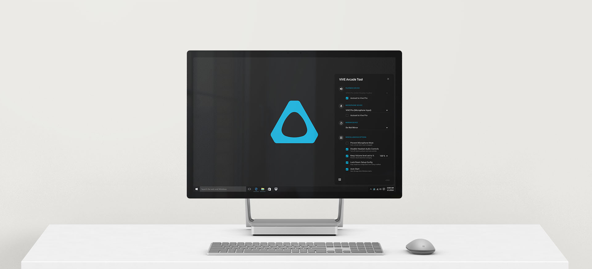
The Vive Arcade program provides the capability for large scale (multi-room) deployments of Vive systems to arcades, Enterprise, and other environments. In late 2018, our business partners were contacting our sales and support teams to complain about various issues they were seeing with HTC’s hardware. Many of these potentially multi-million-dollar partnerships were threatening to take their business to other hardware suppliers, so it was imperative that we addressed their concerns in a timely manner.
Hardware development and manufacturing cycles are lengthy, compared to the software product cycle, so it would not be possible to replace hardware at scale quickly. Driver and software issues can be fixed in situ but can be time-consuming for an account to deploy and without our ability to control the environment, the risk of introducing additional problems was not insubstantial.
ROLES
UX — Myself
UI — Myself
Development — Myself
PROJECT TYPE
Windows Desktop App
PROJECT TIMEFRAME
6 Weeks
INFORMING THE DESIGN
DATA COLLECTION
To better understand how to design the foundational structure, I needed to research the issues that our customers were facing, brainstorm solutions, and determine how best to present a simple interface that would enable complex functionality.

UNDERTSANDING THE ISSUES
Speaking directly to our business partners as well as our sales and support teams, I was able to collate a list of over 10 critical issues affecting partners of all sizes, from small business ventures to Fortune 500 companies.

DEVELOP TECHNICAL SOLUTIONS
Taking that list, I connected with our internal technical teams as well as with our external technical partners to understand what fixes could be enabled for the short term. In parallel, I worked with the respective teams to get permanent fixes into the product roadmap.
SYNTHESIS
KEY DRIVERS
Armed with the above knowledge, I evaluated and prioritized the inputs and worked with stakeholder to define the following experience pillars:
1
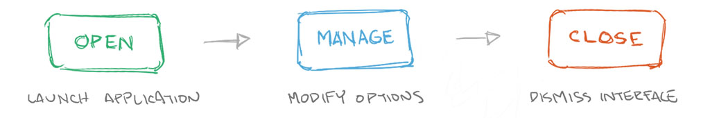
SIMPLICITY
Design a straightforward interface that enabled one-click activation of complex functions.
2
PASSIVITY
Provide a GUI that was hidden to the user but accessible when needed. Enable a set-it-and-forget-it experience.
3
SCALIBILITY
Flexibility to enable more options and advanced features without adding UI complexity.
USER FLOW
The resulting user flow was intentionally minimal.
WIRES + ASSETS
With the urgency of quickly getting the project out the door, after about a week of synthesizing inputs and creating the user flow, I quickly created wireframe sketches.
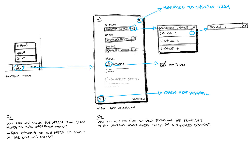
And within a day, I mocked up visual assets in Sketch for implementation.

EXECUTION
DOGFOODING
Using these assets, I creating a working alpha build of the tool in a little over a week. It was critical to start testing the application since there were key partners that considered the issues they were seeing as disruptive to their business operations. In the span of a week, we were able to suss out major bugs and incorporate early usability feedback for a beta release distributed to the wider list of partners.
CHALLENGES
HEADER ICONS MISTAKEN AS BUTTONS
Initially, the header icons were made as squares. Some partners mistook them as buttons. While not a huge UX issue, I decided it was better to adjust the UI design to avoid any confusion.
BEFORE
AFTER

HIDDEN DEVICES IN LIST
The device list is supposed to show you a list of available input/output audio devices. However, if the Vive wasn’t plugged in, it wouldn’t show up in the list. I had to create a “ghost list option” that would show the preferred device even when the Vive was not connected so that the preferred selected device was still displayed.
BEFORE

AFTER

WHAT’S THE DEFAULT?
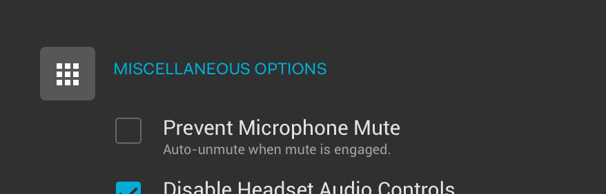
Some partners didn’t quite understand which device was supposed to be selected for audio input and output by default. I addressed this issue by adding a simple auto-set checkbox that set appropriate options that worked for the majority of users, liberating them from having to completely understand the option.
BEFORE

AFTER

Over the course of the following three weeks, I continued to work closely with our partners and incorporated additional feedback and feature requests. The tool was well received and further solidified trust with our current and new enterprise partners which ultimately led to a substantial increase in sales number and reduction in complaints to our enterprise support team by at least 50%.
REFLECTION
FINAL THOUGHTS

While having a separate application was easier to manage for the internal team, it was more challenging for our partners to have to install and manage another piece of software. Ideally, the functionality would be integrated into the existing software that partners already had installed.
The approach I would take now would be to tap into the framework that SteamVR has available for anyone to create custom tabs inside their Dashboard interface. This would accommodate an independent deployment schedule while enabling an integrated experience that doesn’t feel like another piece of software to ask our partners to manage.